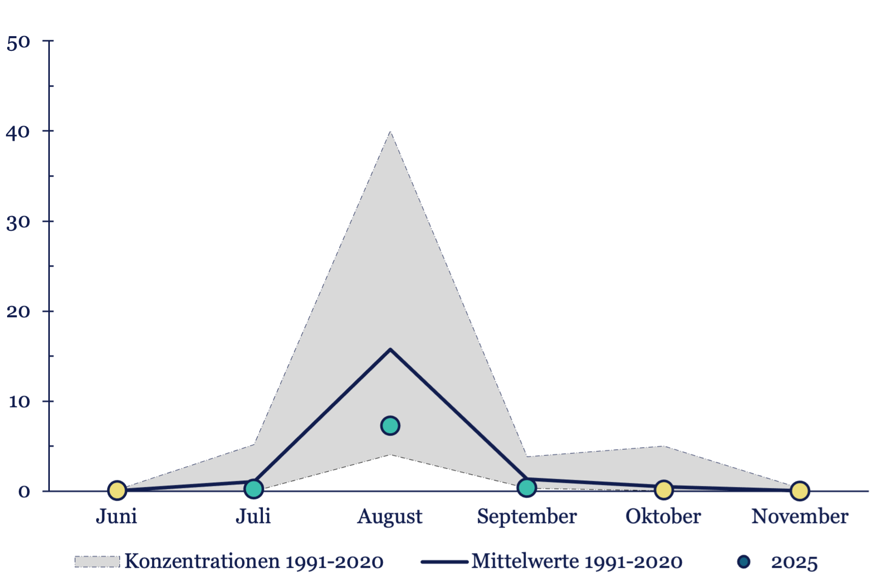
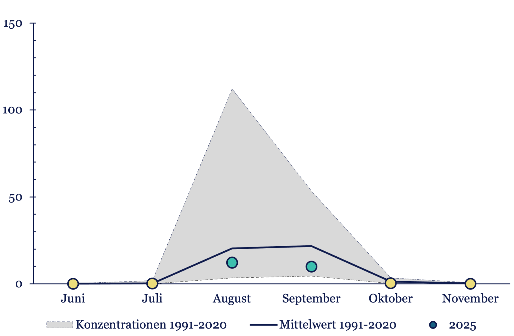
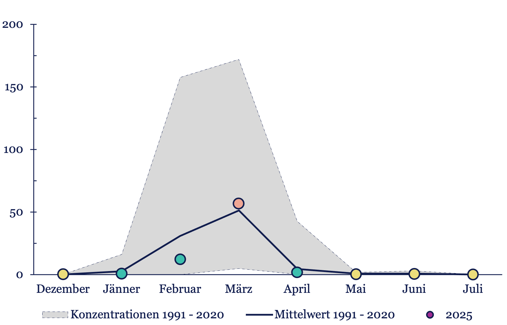
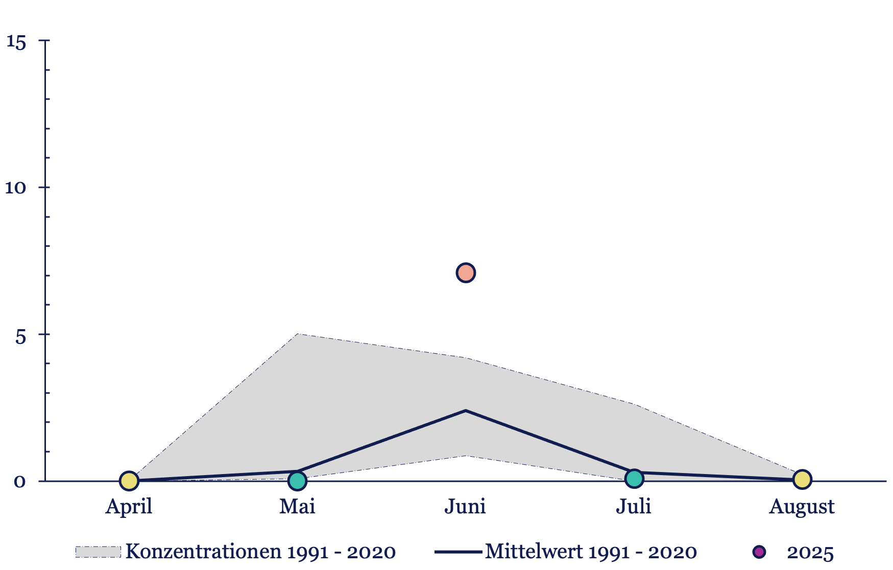
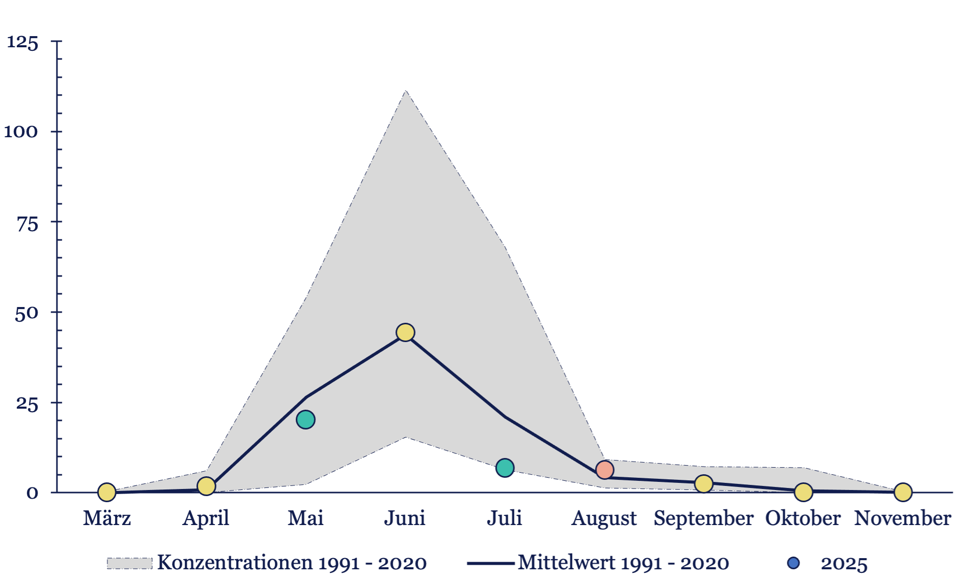
Here you will find graphics of the last pollen season for the most important main aeroallergens compared to the long-term average.
The respective pollen season is represented in its entirety as a monthly pollen integral. The colored dots describe a weaker monthly value (green), an average value (yellow) or an above-average value (red) compared to the long-term average.
With the help of this representation, the pollen count can be easily displayed and deviations from an average season can be recorded at a glance.
Hazel pollen season 2025 in Vienna
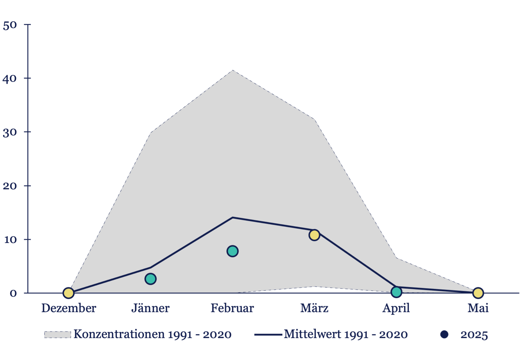
Alder pollen season 2025 in Vienna
Ash pollen season 2025 in Vienna

Birch pollen season 2025 in Vienna

Tree of heaven pollen season 2025 in Vienna
Grass pollen season 2025 in Vienna
Alternaria fungal spore season 2025 in Vienna
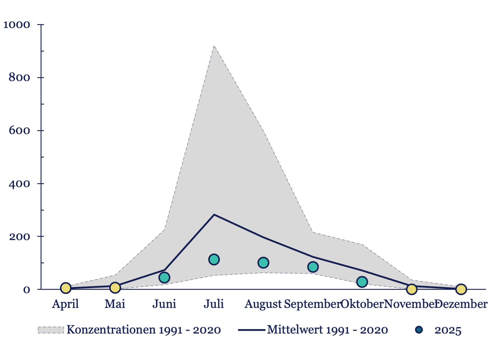
Mugwort pollen season 2025 in Vienna